In this post we describe the fitted vs residuals plot, which allows us to detect several types of violations in the linear regression assumptions. You may also be interested in qq plots, scale location plots, or the residuals vs leverage plot.
Here, one plots  the fitted values on the x-axis, and
  the residuals on the y-axis. Intuitively, this asks: as for different fitted values, does the quality of our fit change? In this post we’ll describe what we can learn from a residuals vs fitted plot, and then make the plot for several R datasets and analyze them. The fitted vs residuals plot is mainly useful for investigating:
- Whether linearity holds. This is indicated by the mean residual value for every fitted value region being close to
 . In R this is indicated by the red line being close to the dashed line.
 - Whether homoskedasticity holds. The spread of residuals should be approximately the same across the x-axis.
- Whether there are outliers. This is indicated by some ‘extreme’ residuals that are far from the rest.
 . In R this is indicated by the red line being close to the dashed line.
Synthetic Example: Quadratic
To illustrate how violations of linearity (1) affect this plot, we create an extreme synthetic example in R.
   x=1:20
   y=x^2
   plot(lm(y~x))
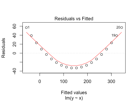
So a quadratic relationship between  and
and  leads to an approximately quadratic relationship between fitted values and residuals. Why is this? Firstly, the fitted model is

Which gives us that  . We then have
(1) 
which is itself a 2nd order polynomial function of . More generally, if the relationship between and is non-linear, the residuals will be a non-linear function of the fitted values. This idea generalizes to higher dimensions (function of covariates instead of single ).
The Cars Dataset
We now look at the same on the cars dataset from R. We regress distance on speed.
plot(lm(dist~speed,data=cars))
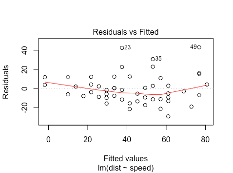
Here we see that linearity seems to hold reasonably well, as the red line is close to the dashed line. We can also note the heteroskedasticity: as we move to the right on the x-axis, the spread of the residuals seems to be increasing. Finally, points 23, 35, and 49 may be outliers, with large residual values. Let’s look at another dataset
Boston Housing
Let’s try fitting a linear model to the Boston housing price datasets. We regress median value on crime, average number of rooms, tax, and the percent lower status of the population.
library(mlbench)
data(BostonHousing)
plot(lm(medv ~ crim + rm + tax + lstat, data = BostonHousing))
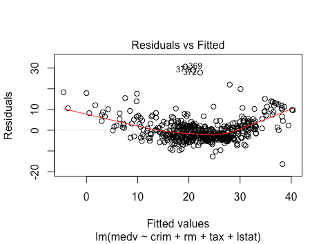
Here we see that linearity is violated: there seems to be a quadratic relationship. Whether there is homoskedastic or not is less obvious: we will need to investigate more plots. There are several outliers, with residuals close to 30.
You may want to check out qq plots, scale location plots, or the residuals vs leverage plot.
The link for qq plots and scale location plots are broken