In this post we describe several methods for visualizing time series data. Time series visualization has several uses. First, it can often help us understand high-level dynamics much more quickly than models, hypothesis tests, or summary statistics. This lets us ask questions like: do certain months/seasons tend to have higher values? What does the long run trend look like? How long are cycles? Second we can check whether data satisfies certain assumptions: for instance, is the autocovariance function constant? More generally, is the data weakly stationary? We can also look at the influence of specific lags on the current value.
We first describe the time plot, then decomposition plots, and then describe several seasonal plots. Next, we show how the ACF plot can be used to inspect weak stationarity, and finally, we look at lag scatter plots. Before we move to analysis, let’s load some libraries.
library(ggfortify)
library(zoo)
library(tseries)
library(astsa)
library(forecast)
library(ggplot2)
Time Plot
The simplest time series plot is the time plot, which has time as the  -axis and the time series values
  as the
  -axis. Let’s try plotting the air passengers dataset from R.
plot(AirPassengers,main='Air Passengers Dataset')
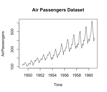
There are three things immediately apparent. First, the number of passengers tends to increase over time. Secondly, there are repeated patterns taking place each year: periodic behavior. Third, the variance seems to increase over time: particularly the ‘swings’ get larger. We’ll investigate this more precisely as we go on. However, it would be useful if we could isolate our investigation of each of these issues into different plots. This is where decomposition comes into play.
Decomposition
A time series has four component series: 1) the trend  describes long run behavior 2) cycles
  describe medium term, non-repeated deviations from trend 3) seasonality
  describes periodic or repeated fluctuations 4)
  noise or remainder: random fluctuations.
In many cases the trend and cycles are combined into a single trend-cycle or trend component. This is generally denoted as well. The decomposition of the time series is then either an additive decomposition
(1) 
or a multiplicative one
(2) 
Which one should you use? One should use an additive decomposition if the magnitude of the seasonality does not depend on the magnitude of the values of the raw time series, while one should use a multiplicative one if it does. The time plot in the previous section, which shows increasing variance, suggests the latter. Particularly, it suggests that as the magnitude goes up, the magnitude of the seasonality goes up as well. This post describes these issues in more detail. Let’s load some libraries and then visualize the decomposition.
decomposed_air_passengers<-decompose(AirPassengers,type='multiplicative')
autoplot(decomposed_air_passengers)
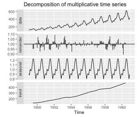
We can see several things. First, the trend-cycle is approximately linear. Secondly, the seasonal component seems to start each year low, rise in the middle (summer?), and then go back down. Third, the remainder appears to have a pattern. It doesn’t look like random noise: most likely the decomposition technique fails to capture part of the true seasonal component. While the seasonal plot is useful, we might be interested in other representations of the seasonality.
Seasonal Plots
There are several very useful seasonal plots in Rob Hyndman’s forecast package, which he also describes in his book.
Seasonal Plot
The first plot to make is the seasonal time plot.
ggseasonplot(AirPassengers)
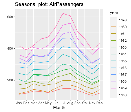
This makes a different line for each year: it then becomes easier to isolate patterns. There are two things we can now often answer: what are general patterns, and do those patterns persist over time? Note that it’s easier to answer these questions if the trend is monotonic. For instance, we can see that there are always fewer passengers in November than December, while for July vs August it could go either way. In the early years January had fewer passengers than February, but that reversed in later years. It also makes the increase in the summer months very clear compared to the decomposition plot.
The seasonal plot for the seasonal component of the decomposition is also useful, as it lets us avoid having to think about the change over time.
ggseasonplot(AirPassengers,polar=TRUE)
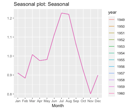
This again isolates the seasonal component.
Seasonal Polar Plot
We can also make a polar plot similar to the above.
ggseasonplot(AirPassengers,polar=TRUE)
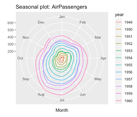
The advantage here is that it’s somewhat easier to compare months to passenger thresholds as references. We can see a lot of the same information: November tends to have very low values, while August and July have higher values. However, it’s difficult to compare whether relative values hold across months in the inner layers.
Seasonal Subseries
We can also plot a seasonal subseries, which shows, for each month, the evolution over years.
ggsubseriesplot(AirPassengers,main='Seasonal Subseries for AirPassengers')
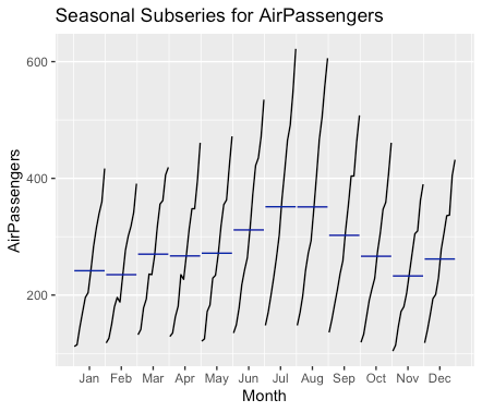
The blue horizontal lines give the mean. This makes the evolution over time perhaps somewhat clearer than the original seasonal plot, but makes the between season dynamics a little bit less obvious: particularly whether they persist or not. For instance, we can’t tell that November always has fewer passengers than December in this dataset.
Other Plots for Seasonal Data
Some people use box plots or possibly a mean bar plot. However, these plots should be used with great care as the interpretations are confounded by trend and cycle. For instance, in a boxplot, instead of capturing 25 and 75 percentiles of a single distribution, you capture trend and cycle. You could have a box plot that is the seasonal component plus the remainder, but in general it’s dangerous to use box plots and bar plots for time series data as one risks wrong conclusions.
ACF Plots
The ACF plot can be also be used to check for trend or cycle and seasonality. If the data has no trend or cycle then the ACF plot will show rapid decay, while if it has no repeated pattern then it does not have seasonality. Thus the ACF plots can be used to check for some violations of weak stationarity. Let’s look at the ACF plot of the original series
acf(AirPassengers)
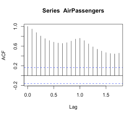
Here we see both slow decay, indicating trend and/or cycles, and repeated patterns up and down, indicating seasonality. Note that while weak stationarity implies that the ACF plot will decay very quickly and not show repeated patterns, the converse is not true. One can have a time series with non-constant variance where the ACF plot has fast decay and no repeated patterns. Consider  . We can sample a
  -step trajectory and plot this as follows:
z<-c()
for(i in 1:100){
  z<-c(z,rnorm(1,0,i^2))
}
acf(z)
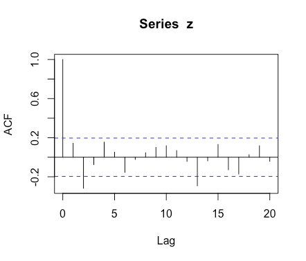
This series violates weak stationarity as the variance increases over time, but it’s difficult to see violations from the ACF plot. Thus one can use ACF plots to rule out stationarity, but can’t use them to confirm it.
One useful thing to check is the ACF plot of the remainder. We’d like it to display neither trend/cycle nor seasonality.
Remainder<-na.remove(decomposed_air_passengers[['random']])
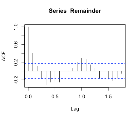
The remainder exhibits seasonality, suggesting that the decomposition failed to completely isolate the seasonal component. Another possibility is that it is an AR(k) process with  and alternating signs. The R function decompose() function assumes that seasonality is not time-varying, which is probably what leads to this issue. One simple way to deal with it is to difference the remainder. We do so and plot it.
acf(diff(Remainder))
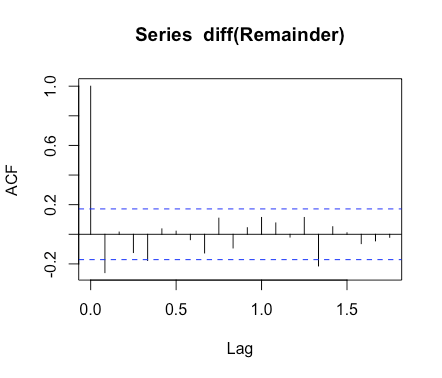
There’s no longer any obvious seasonality.
Lag Plot
The lag plot is simply a scatter plot of some lag vs the current value of a time series. One can use it to detect non-linear relationships and relationships without constant variance between lags and current values. Let’s make the AirPassengers lag plot using the atsta library with lags  to
to  .
.
lag1.plot(AirPassengers,9)

We see two things: one is that the plots look a funnel or fan, suggesting variance increases with magnitude. Particularly, there is more variance with more passengers, and passengers are increasing over time, so variance is increasing with time. The other thing we see is that there is some non-linearity. We can correct for both of these by taking the log of the series. This is discussed here, along with several other methods for handling such data.
lag1.plot(log(AirPassengers),9)

Now the relationship looks linear and the variance looks constant.
Discussion
In this post we show several methods for visualizing time series data. We first describe what one can see in time plots, how one can isolate the components in the time series with plots of a decomposed time series, how one can further isolate seasonal behavior using seasonal plots from Rob Hyndman’s forecast package, how to use ACF plots to detect trend/cycle or seasonality, and how to use lag plots to check for non-linear relationships or those with non-constant variance.