In this post we describe basic visualization of missing data patterns in R with VIM. We describe how to see which variables are missing more often and how to check some basic assumptions such as missing completely at random (MCAR). We focus on three main functions: the aggr function, the margin plot, and the box plot.
The Aggr Function
The aggr function creates two plots that give a quick visualization of two things:
- What percent of each variable is missing
- The missingness frequencies of pairs of variables
Let’s load the VIM package and look at their brittleness dataset. This dataset measures the brittleness of product produced in reactors 104, 105, 107, respectively.
library(VIM)
aggr(brittleness)
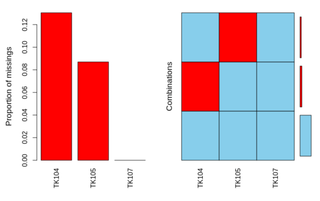
In the first plot we see that reactors 104 and 105 have missing data, and 107 does not. The second plot shows that T104 has missing data only when T105 and T107 are complete, while T104 has missing data only when the other two are complete. In particular, there are no observations where both reactors 104 and 105 have missing data. There are thus only two missingness patterns. For some imputation methods, such as certain types of multiple imputation, having fewer missingness patterns is helpful, as it requires fitting fewer models.
The Margin Plot: Checking Missing Completely at Random (MCAR)
The missing completely at random (MCAR) assumption is that the missingness probability  is independent of both the observed and the missing data. That is, if
  is the observed data and
  is the missing,
  and
and  . Here
  means independent and
  means there is a dependency structure. Under this assumption, for any two pairs of variables
  and
and  , should have the same distribution regardless of whether is observed or not. The margin plot lets us check that visually. Note that since we’re checking pairs only, there may be other ways to violate this assumption. The margin plot is however a good start. Let’s take a look at it for the brittleness dataset.
marginplot(brittleness[,1:2])
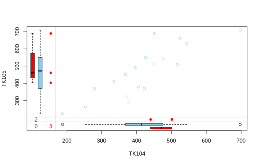
Look at vertical box and whisker plots. The blue one summarizes the distribution of TK105 when TK104 is observed. The red one summarizes it when it is unobserved. Similarly for the horizontal box and whiskers plot, the blue summarizes TK104 when TK105 is observed. The red summarizes TK104 when TK105 is unobserved. Because there are so few unobserved cases, it’s difficult to say whether the blue and red are different in either case, but if they were, that would be a violation of (MCAR). If MCAR is violated, then the simplest method, complete case analysis, where one deletes any observations with missing data, will be biased.
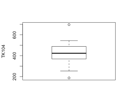
The Box Plot
The box plot in VIM take two datasets for two random variables that are observed pairwise, let’s call them  and
and  , and plots three boxplots for . The first gives the standard boxplot of the marginal distribution. Let
  denote that is missing. Then the second gives the boxplot of
  , the boxplot conditional on observed data for . The third is the boxplot of
  , the boxplot conditional on missing data for . Let’s try letting be TK104 and be TK105.
pbox(brittleness[,c(1,2)])
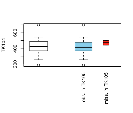
We obtain three boxplots for TK104. In white we see the marginal boxplot and in light blue we see the boxplot conditional on observed data, which looks very similar. In red we see the boxplot conditional on missing data: this appears to have the median and 25 and 75 percentiles shifted up. If there were more missing observations, this would suggest that the missingness is missing at random (MAR) or missing not at random (MNAR), but not missing completely at random (MCAR). However there is not enough missing data to make strong conclusions.
We can also make the same, but with the and reversed.
pbox(brittleness[,c(2,1)])
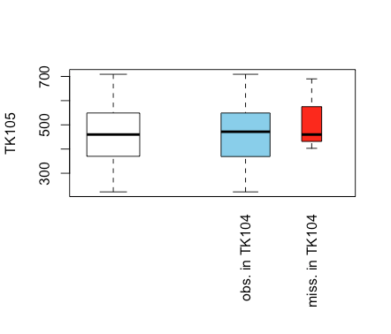
Here we have three boxplots for TK105. Here, conditional on TK104 the boxplot appears the same, while when TK104 is missing it is shifted upwards slightly other than the median. Again, there isn’t really enough data in this dataset to make a strong conclusion.
If we plot either of TK104 or TK105 conditional on TK107, we see that since TK107 has no missing data, we only get a single plot.
Discussion
In this post we show three methods for visualizing missing data across jointly observed random variables. The aggr function takes all observations across all random variables and lets us visualize missingness frequencies and missingness patterns. The margin plot takes the observations from two random variables and gives us a scatterplot along with two boxplots the boxplots allow us to evaluate the MCAR vs MAR assumptions. The boxplot from the pbox function gives boxplots for one random variable conditional on whether or not another is missing.